The Challenge
RLC’s website was facing low user engagement, and the existing website no longer aligned with their newly defined brand tone and visual guidelines. The goal was to identify usability gaps, improve clarity and navigation, and redesign the experience to feel more engaging, intuitive, and on-brand.
Our Approach
Our approach addressed low engagement and misalignment with RLC’s evolving brand. We conducted a heuristic evaluation, user research, and competitive benchmarking to identify key gaps, then translated insights into a prioritized redesign through iterative wireframing and full-site UI design. The final experience aligned with RLC’s brand tone, leveraged a scalable design system, and was implemented collaboratively with the client and development team.
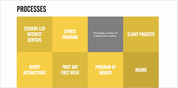
old site, with no clear guidance
for new users
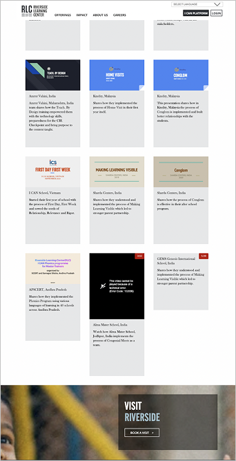
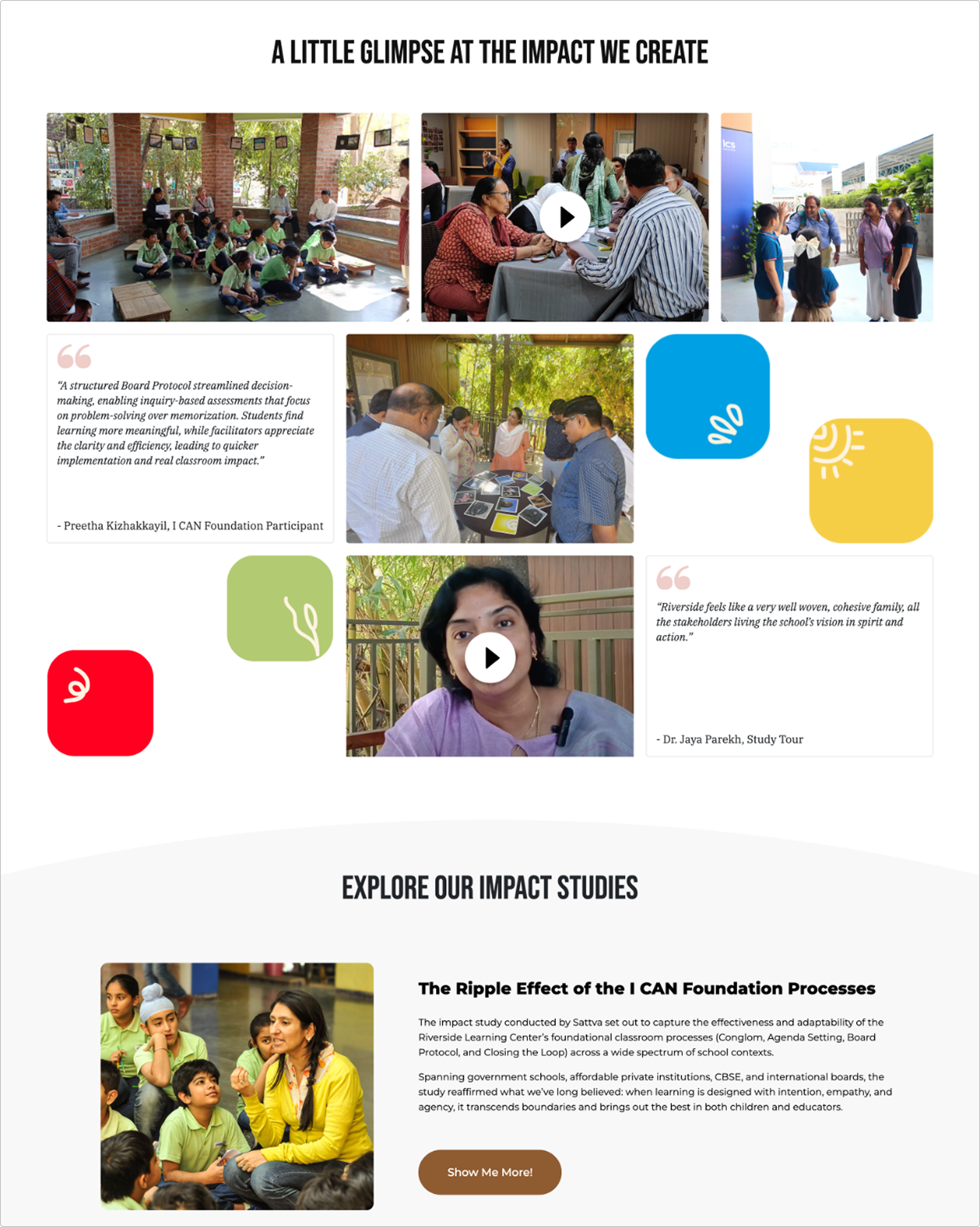
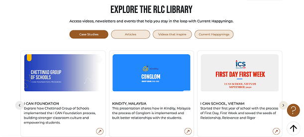
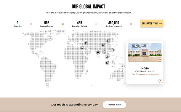
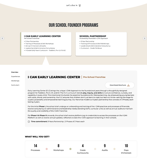
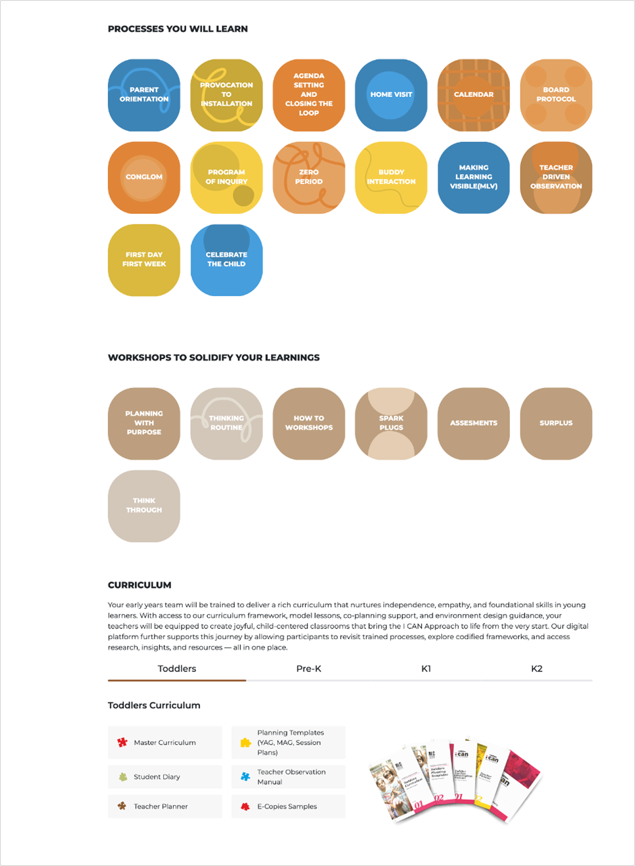
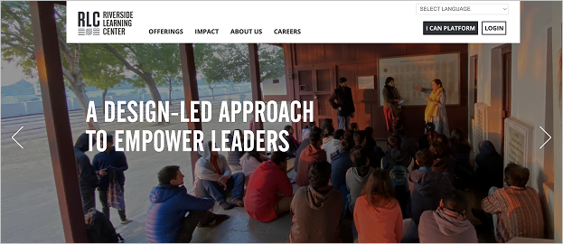
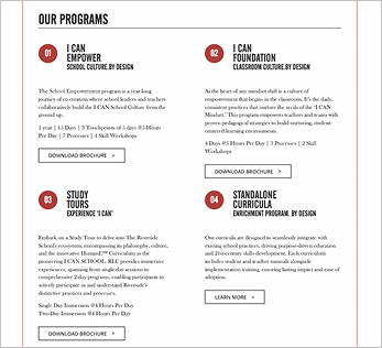
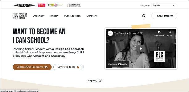
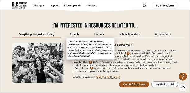
The Outcome
The redesign resulted in a cohesive experience that clearly aligns with RLC’s new brand vision and evolved educational philosophy. Navigation and information hierarchy were simplified across devices, improving overall clarity and usability for users across key journeys. The project was successfully handed off and implemented in close collaboration with the development team, ensuring design intent was maintained through build.
tone of voice for new and returning users
users seamlessly